Optimizing Your Shopping Cart for eCommerce Sales
When determining how to approach the strategy for any part of your business, it’s vital to start with the primary goal. What’s the top goal for your shopping cart? Conversion.
While that may sound obvious, many companies try for a “more is more” strategy. They’ll take every opportunity to use valuable real estate on a webpage and try to fit more on a page. More design, more options, more text.
For the love of money, please keep it simple. A messy shopping cart page will confuse customers and distract them from the order process. That means fewer orders for your company – and frustrated potential customers you won’t have the pleasure of serving.
Do right by your company and your customers by prioritizing simplicity and focusing on conversion. Follow these tips to optimize your shopping cart.
Shopping Cart
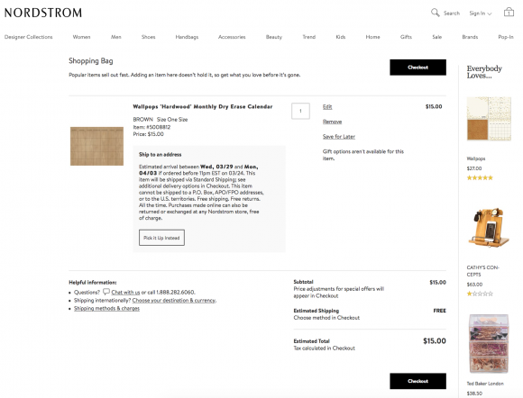
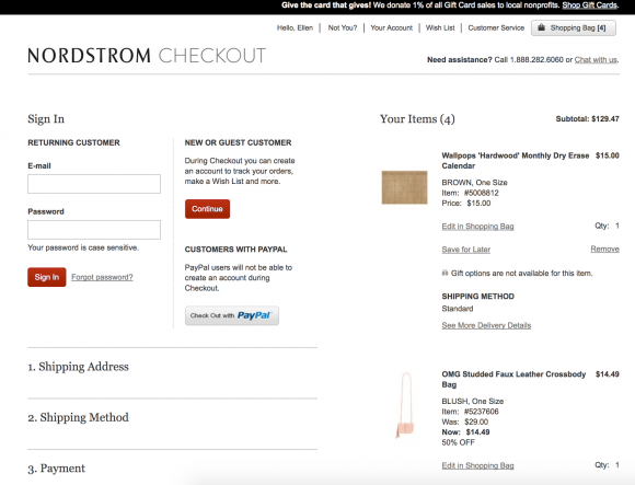
This example from Nordstrom showcases some key ingredients for an optimized shopping cart:
Minimize distraction
Once your prospect is peering into their shopping cart, the goal is to convert them into a customer. At this stage, minimize distractions and encourage the next step: checkout.
A white screen will help focus attention on the vital element: a checkout button. Ensure that no pop-ups, advertisements, non-essential information, or other distractions are appearing in the shopping cart.
Allow easy editing
If a customer notices that they’ve added more of a specific item than they intend to purchase, it should be a quick fix. Ensure that this stage allows a customer to easily edit the number of items they’d wish to purchase and remove entire line items.
A/B test the display of upsells
If other distractions are properly minimized, you’ll have room to play with how your shopping cart displays upsells. A/B test the placement of upsells. For example, you may feature them in a side column or below the checkout button.
When displaying upsells, it is important to only display targeted, complementary products. Competing products will confuse the buyer and undermine a shopper’s confidence in the items they’ve already placed in the shopping cart.
To ensure customers don’t get leave their shopping cart, include an “Add to cart” button next to suggested items.
Answer questions
Anticipate the reasons a customer may not purchase from you, so you can preemptively strike a cord of confidence.
For example:
- Is my item in stock?
- When will I receive it?
- Why should I buy now?
- Why should I purchase from you?
Verify availability
Noting that an item is “In stock and ready to ship!” can entice a customer while easing their fears. Ensure that the selected inventory is available, then relay that information to your customer.
Confirm delivery timeframe
Let customers know how long it’ll be until they can expect to receive their potential order. If there is a long processing time, explain why. Unless a customer is in a hurry, they may be happy to wait for a great product – as long as you’re upfront about the timeframe.
A simple note can humanize your company and satisfy your customer’s curiosity; e.g. “Because our products are custom-made with love, please allow 10-15 days for us to process your order. Thank you for your support!”
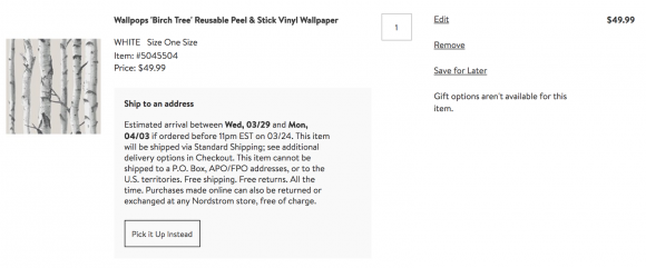
In this example from Nordstrom, the customer is notified of a clear delivery window, which has already factored in processing and transit times:
Reinforce benefits
Is customer satisfaction guaranteed? Do you offer free returns? Feature this information to reinforce the benefits of buying today – and boost their confidence in ordering from your store.
Examples:
- “Satisfaction Guaranteed”
- “Ships within 48 hours”
- “30 Day Return Policy”
- “Discreet Shipping”
- “Free Shipping Over $48”
Encourage checkout
Prominently feature a checkout button in both the top and bottom of the shopping cart screen. One of the most frustrating experiences potential buyers experience is a camouflaged checkout button. Your checkout button should be featured clearly and visibly in a color that contrasts the surrounding page. Consider A/B testing button colors outside of your normal brand color codes.
Increase trust factors
Customers have plenty of experience with unreliable companies and poor customer service, making them wary of online stores they’ve never purchased from. Take extra measures to reassure prospects that your website is trustworthy and your company is reputable.
Add an SSL certificate seal or payment logos, and include badges from consumer review websites you are a member of. TrustPilot, ResellerRatings, and the BBB are highly-recognized and trusted sources that will reinforce trust.
Offering an option to chat with a live team member or automated support system is another great measure to build trust and capture more sales.
Checkout page
This is the moment you’ve been waiting for! The remainder of the checkout process should be similarly streamlined with a clear journey to order completion.
Remove the navigation menu
The customer has officially signaled that they’re ready to purchase. It’s time to remove the navigation bar so they’re not tempted to look at more product categories. Consider A/B testing a “Continue shopping” button to see how it affects your conversion rate.
Don’t force account registration
Adding unnecessary steps will increase customer drop-off. Make it easy for existing customers to login and for new guests to register, but don’t let this take up too much real estate. If a customer doesn’t want to sign up, it should be easy for them to skip to the next step in the ordering process.
Alternatively, you can skip account registration in the beginning of the order process entirely. Instead, encourage the customer to create an account on the “Thank You” page – after they’ve placed their order. Prepopulating their email address at this stage will make it easy for purchasers to simply enter a password to register.
Streamline the process
Reduce your order form to the necessary elements. If it’s not essential to fulfilling the order, remove it from your form. While you may be tempted to collect marketing data, adding unrequired fields will likely decrease your conversion rate.
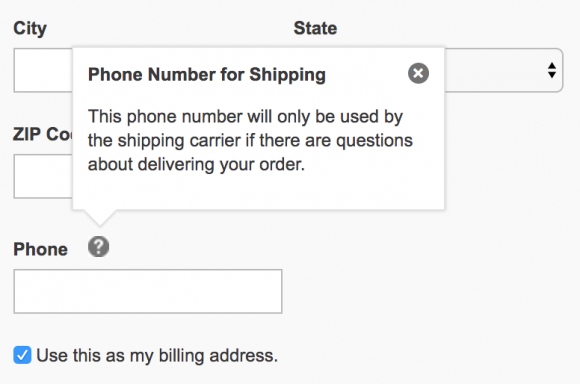
If you’re asking for information such as phone number (which many customers are hesitant to divulge), tell them why it’s required; e.g. “For shipping-related questions”. This can set a customer at ease and let them know they won’t be waking up to a Saturday morning robo-call.
Minimize the number of pages a customer will need to fill out. If possible, limit the checkout process to a single page.
Utilizing auto-fill technology can quicken checkout and impress customers. For example, entering a zip code can populate the corresponding city and state.
At the end, encourage checkout with a large, visible “Submit order” button.
Don’t lose to a discount code
If you don’t often provide discount codes, minimize the “apply coupon code” button. If customers see a glaring “Got a coupon? Enter it here”, they’ll likely wander off the page to search for a coupon code… and you may never see them again. Instead of displaying a box to enter a code, include minimized text that reads, “Got a coupon code?” that populates an input field after the customer clicks it.
Similarly, you can display a popup to first time visitors, offering a discount code in exchange for their email address. This will make the visitor feel like they’re getting a deal instead of “missing out” on a coupon code. And, of course, you’ll have the added benefit of retargeting them later.
Provide attractive options
Payment options
Offering various payment options including PayPal can allow your business to capture more sales while catering to customer preferences.
Shipping options
Giving options for expedited shipping allows you to capture sales from customers in a hurry to receive a purchase. Without upgraded shipping options, you may lose sales to online competitors or local merchants. When listing shipping options include timeframes; e.g. “Standard shipping (5-9 days)”.
If shipping is expensive, tell the customer why; e.g. “Your order will be shipped in dry ice, ensuring the contents will arrive in prime condition.”
Order Summary
“Just the facts, ma’am,” sums it up. An order summary page can reduce unnecessary customer service inquiries. Confirm the details of the customer’s order and give them one last opportunity to fix any errors in their order or shipping information.
Include:
- Product images
- Product names
- Prices
- Quantity
- Order total
- Billing information
- Shipping information
Feature one last “Submit order” button to seal the deal.
P.S. Want even more tips? Pair this article with Top 10 Ways to Lower Shopping Cart Abandonment Rates and Increase Sales Conversions.
Post-checkout
You did it! You’ve converted another prospect into an excited customer. This can be the beginning of a beautiful relationship.
Continue to A/B test elements of your checkout process to optimize your success and increase your conversions. And don’t forget to stay up-to-date on the latest shopping cart innovations; there will always be new and exciting ways to turn shoppers into buyers.
Happy converting!